Not that I'm suggesting you face off in a Photoshop cage fight or anything - don't mean to be misleading with that title.
(Though that would be awesome.)
Are you a designer? Or an art director? There's a difference. And knowing the difference will help your overall job satisfaction. (Kinda like how I did an account management internship one year and learned that I'm good at it. but absolutely hate it.)
This post is important for writers too. It will help you understand who you're working with and how to best work with them.
Enjoy this lengthy, but super helpful post. I even learned a little something too.
(That's my one thing for today so no more learning until tomorrow. Woohoo)
Our first order of business is to try to figure out what the
differences and similarities are between visual advertising and graphic
design.
When I first got into advertising, my colleagues and I had the very
snobbish and very wrong idea that advertising was better than graphic
design, that it had better ideas, that graphic designers were just
around to make things look pretty, that the more strongly conceptual
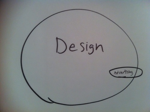
work was done by ad people. If you had asked us to draw a Venn diagram
of the two disciplines back then, it would have looked like this:
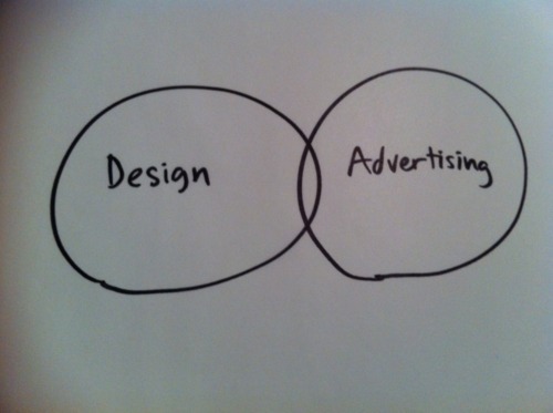
We would have said that designers were all about peripheral marketing
materials, annual reports, shopping bags, things of that nature. We
would have insisted that advertising was about important things!
Double-page spreads! Television commercials!
Many designers were rightfully insulted by this kind of thinking – including one very famous one.

Jonathan Ive is the Senior Vice-President in charge of design at
Apple Computer, responsible for the groundbreaking design of the iPhone,
various iPods, the Macbook Air, the iMac– the list goes on and on. The
interesting thing, though, is that Jonathan Ive almost resigned from
Apple before any of those products saw the light of day. And the reason
he almost resigned was that for the longest time, he wasn’t permitted to
do the job of a designer the way he understood it. Apple’s hardware
engineers would bring him the box of wires and circuit boards and say,
“Here. We need you to design a nice-looking case for this.” But as a
designer, Ive knew that his work needed to start well before then –
right back to when the product was first conceived. Eventually, he got
Steve Jobs to understand it, too.
To persuade Ive to stay, Jobs agreed to give him meaningful input to
his products from the earliest stages. With this new influence, Ive
helped to create the first iMac computers in 1998…
…which launched Apple on its way to where it is today – the most valuable and admired brand on the planet.
There is a difference between the disciplines of graphic design and
advertising, but there is also a great deal of overlap. Here’s something
to look at.
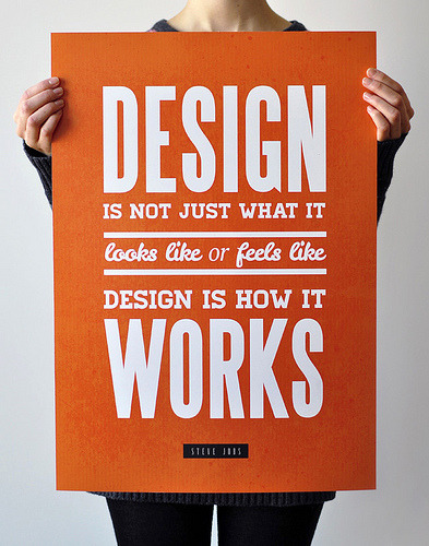
Although this is obviously an example of graphic design, I don’t
think you would describe it as an ad. Now, let’s look at something else:

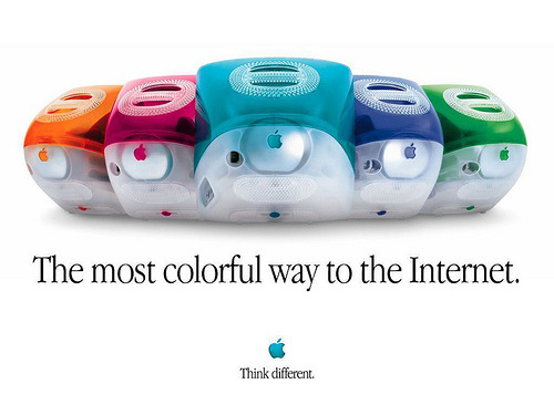
Would you describe it as an example of advertising? Of course you
would. But you would also have to describe it as an example of graphic
design. So, while it’s clear that not all graphic design is advertising,
it is equally clear that almost all advertising does involve design –
even radio commercials, because the sound effects and music placed
behind the announcer’s voice are referred to as “sound design.” Thus,
the appropriate Venn diagram to describe the relationship between
advertising and design actually looks like this:
(I’ve allowed advertising to spill out of design a bit because of the
possibility that a stunt – or something – might require no design at
all.)
So, advertising is just one small part of a much larger universe
called design. But what makes advertising its own little dot inside that
diagram? What sets it apart? Let’s look at the next slide and see if we
can find an answer.

What’s going on here? We see there’s an arrangement of typography and
illustration here, so we know there was graphic design involved. But
what is the concept? Well, we’re looking at an architect’s blueprint for
a house, but the weird thing is that the family’s vehicle is included
as if it were really part of the floor plan. So the concept, or the
point they’re trying to make, is pretty clear here. They’re telling us
that a family’s car is an extension of their home. Some families
practically live in their cars, so I think this is a sentiment we can
all recognize and get behind. But for all that, I don’t think this is an
ad. Not yet, anyway. Now, I’m going to show you this piece of design
again, but this time with an important difference.
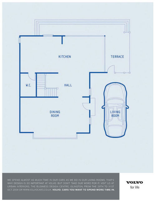
What has been added here is a sign-off identifying Volvo as the
source of this design thought. There’s also copy expressing how Volvo
understands that a car is effectively a second living room, and that the
company takes design very seriously for that reason. I think we can all
now agree that this is most certainly an ad. So what were the
differences between this ad and the previous slide? Well, we’re now
seeing that the interesting design concept is being presented for the
benefit of a particular product.
We’re also seeing that there’s an
explicit call to action – the reader is being invited to see a Volvo
design exhibition. There’s also an implied call to action – buy Volvo
cars. So, for the purposes of today’s talk, I’m going to define
advertising as follows:
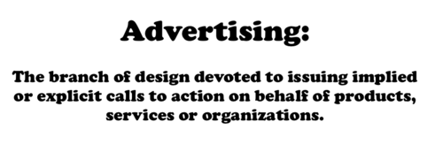
Typically, the call to action is “buy this product” or “try our
service.” But sometimes ads ask for political action or charitable
donations, so our definition needs to be flexible enough to accommodate
this possibility.
There is far more respect for design today than there was when my
career began. I think the brilliance of Apple’s success is part of the
reason for that. It has made us aware that design is central to every
manmade product, process and activity. The design might be brilliant or
mediocre or downright terrible, but the design is there nonetheless. The
limitation of advertising is that it generally has no opinion on
products or practices until it’s time to write the creative brief.
Practically speaking, ad agencies don’t get involved until a product is
well on its way to being in stores.
By contrast, designers (be they product designers or graphic
designers) have the potential to improve products or processes from the
moment of their conception. Good design makes itself felt in all our
interactions with a brand. You might recall the launch campaign for the
iPod, a campaign in which the posters looked pretty much like screen
grabs from the TV spot.
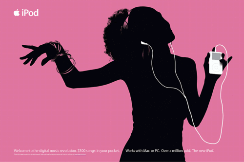
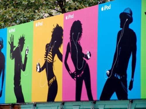
It’s interesting that the launch commercial looked more like a piece
of design than an ad. It was all graphics and sound with no explicit
sales message, but it sold hard nonetheless. It was a wonderful piece of
design because it felt like the product it was selling. It was cool,
thrilling, simple and human. In recent years, ad agencies have trumpeted
their ability to make brands consistent and recognizable at every point
of communication the way Apple has, but good designers have always
known the importance of this.
Another reason design is getting more respect these days is that more
and more ads draw their thinking from the grand tradition of poster
design. When my career began, the concept of most ads was found in the
headline. But for the past decade or so, ad concepts have been visually
driven. Today, many advertising concepts are virtually indistinguishable
from the design concepts that appear on event posters. Here’s an
example.
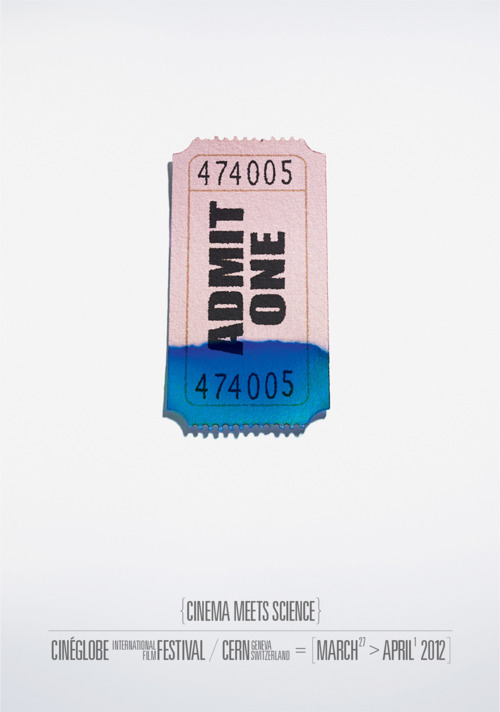
Here, we’re seeing a mash-up of the visual language of movie theatres
and the visual language of the chemistry lab, all in service of
promoting a scientific film festival. The thinking here is pure graphic
design, but it’s coming from an advertising agency – the very respected
Legas Delaney of London.
But the most important reason design is getting more respect these
days is the relatively new and still-scary blank page known as the
Internet. This is a blank page that is communicating across cultures and
languages, and because of that, icons and images are supremely
important, as are the ways in which users interact with them.
Clearly, to manage this new frontier, it’s the designer’s training you want on board more than the advertising art director’s.
So now we know that if you decide to be an advertising art director,
your design concepts will be dedicated to selling products or services
or ideas. That’s okay on a theoretical level, but you probably want to
know about the practical differences your decision will make. Okay, so
here goes. The first big difference is in your earning potential. Your
pay in your first job will probably be terrible whichever path you
choose.

However, the potential salary for an art director is way higher.

If you are an award-winning art director, you could be earning six
figures in just a few years. Most designers don’t earn that much that
quickly. Money should never be your only reason for doing anything, but
if salary potential is an issue for you, you’ll want to consider a
career in advertising.
However, there is definitely a price to be paid for that higher
potential salary, and that is in the relative volatility of the two
industries. Simply put, jobs in graphic design are way more secure than
jobs in advertising. The reasons have to do with the business model of a
design firm versus an advertising agency.
Design firms are usually hired by the project – an annual report, a
corporate identity, a package design and so forth. A design firm might
therefore have dozens of clients, and losing one or two clients is no
big deal. At busy design firms, layoffs don’t happen all that often,
unless the entire economy is suffering. By contrast, advertising
agencies don’t spend a lot of time doing project work.
They need to rely
on substantial monthly retainers paid by a smaller number of clients.
So, if one large client cuts its spending or fires the agency, the
agency’s revenue can drop so sharply that jobs have to be cut, and one
of those jobs might be yours, even if you’ve been doing a good job.

If you stay in advertising long enough, this is almost certain to
happen to you sooner or later. So, if you’re the sort of person who
places a lot of value on a secure job, you will probably be happier in a
design firm than in an ad agency.
Another important difference between design and advertising is how
concepts get generated – how your work gets done. As graphic designers,
you will typically work alone. You’ll get the brief, go to work on some
ideas, and if you’re awaiting copy from the client or from a writer,
you’ll just flow in Greek copy as a placeholder. You might not ever meet
or speak to the person who’s writing your copy. If it’s an annual
report, you’ll get your copy emailed to you, and if you don’t have any
questions, that’ll be it.
Good advertising agencies work differently. Typically, creative
people in agencies work in teams. In an ad agency, an art director is
paired with a writer in what is pretty much a full-time partnership. You
take the brief together, and you work on it together, batting ideas
back and forth. And there’s a lot of overlap in your roles. You might
suggest a headline thought to your writer, and your writer might suggest
a certain illustration style to you. All things being equal, a happy
creative team can produce a lot more cool ideas than someone working
solo. And, indeed, some amazing careers have been built on this sort of
teamwork. But creative partnerships are like marriages. When they work,
they’re awesome, but if they’re not working, they can be a source of
pure misery. So if you’re interested in being an advertising art
director, remember that you’re going to be spending a lot of hours
trusting in and relying on your writer. If you enjoy jamming with
people, you will probably do just fine. But if you prefer disappearing
into your own head when you work, you might be happier working solo as a
designer.
Now would be a good time to talk about the history of advertising,
because that, too, might affect your decision. Fifty years ago, ad
agencies actually worked more like design firms. Writers and art
directors were in separate departments. The art director would wait
until the copywriter came down the hall with his copy sheet. Only then
would the art director start thinking about how to handle things
visually. But all this changed in the early 1960s because of what is
known in advertising as The Creative Revolution. It was hugely important
to our business, and it all started because of one man.
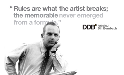
This is the late Bill Bernbach. He is still viewed today as the
single most important figure in the history of advertising. Bill
Bernbach was one of the founding partners of the New York agency Doyle
Dane Bernbach, which is today known globally as DDB.
When Bernbach started his agency, he made some radical changes in how
advertising got made. Every other ad agency had writers and art
directors working separately; Bernbach got them working in teams. Every
other ad agency hired blond-haired white boys who had graduated from
private schools; Bernbach hired people from working-class immigrant
families: Jews, Italians, Germans – even women. Bernbach had a core
philosophy about advertising, and it’s a philosophy that still dominates
today. It is the philosophy that advertising doesn’t work at persuading
people unless it reaches people emotionally. And to reach people
emotionally, you have to say things that are insightful and true to the
human condition. The most famous work Doyle Dane Bernbach did was for
Volkswagen, and the single most famous ad they ever did for Volkswagen
was this one.
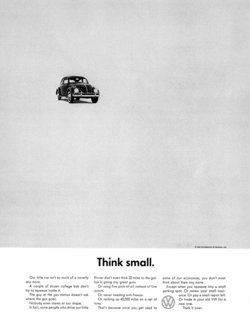
Now, you’re probably thinking, “What’s so special about
that ad?
I’ve seen lots of ads that look something like that. What’s the big
deal?” Well, the fact that you’ve seen lots of ads that look like this
is a reflection of how important this ad still is, fifty years later. To
understand how arresting this ad was when it first appeared, you have
to look at other car ads of that era.
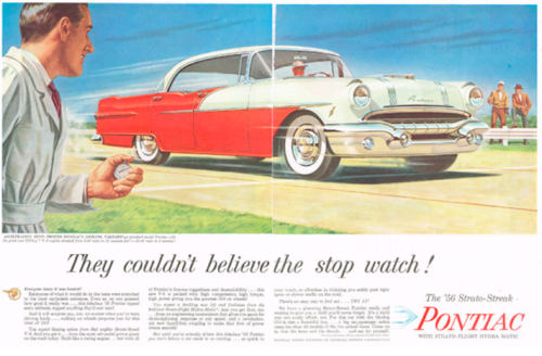
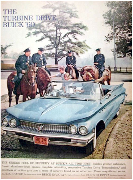
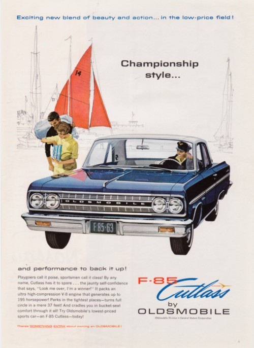
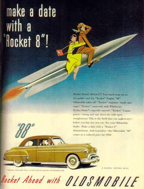
The first thing you’ll notice is how over-the-top the scenarios are.
For one thing, people are depicted as being absurdly happy just because
they’re near a car, for goodness’ sake. Also, these ads present
fantasies as if they were reality. Most people don’t belong to country
clubs or go yachting, but before DDB, advertising would present such
scenarios as if they were fact.
So, the “Think Small” ad was arresting for the modesty and simplicity
of its art direction. But the writing would also have caused a bit of a
head snap back then. The years following the Second World War were a
time of explosive growth and progress in America. People were earning
more and more money to buy ever bigger homes and cars. Back then, people
would say, “You’ve got to think big!” absolutely without irony. So, the
exhortation here to “Think small” would have been almost shocking, and
it would have pretty much guaranteed that the ad got read.
Let’s look at another famous ad from Doyle Dane Bernbach. This was an ad they did for Avis Rent-A-Car.
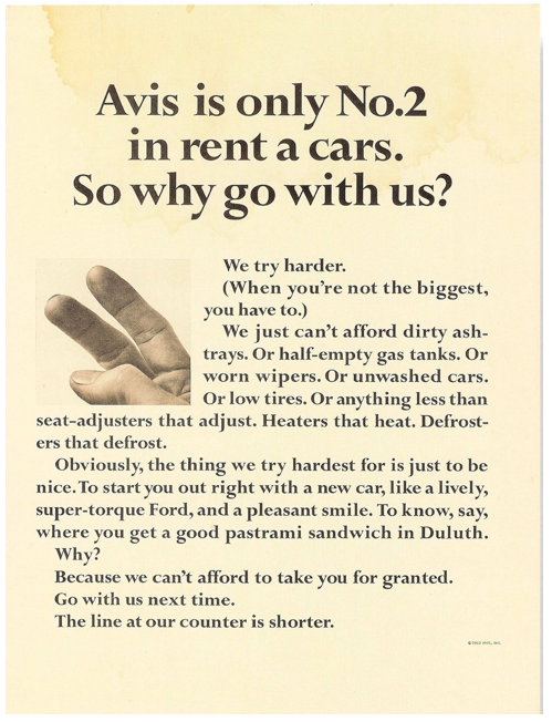
Again, there is nothing shocking about this ad if you view it through
modern eyes. But remember, this was done in an era when people bragged
about being number one. Back then, America
was Number
One. Nobody would have proudly announced that they were an also-ran.
So, by proclaiming their Number Two status, Avis got people’s attention,
and they rewarded it by stating some very human truths. We all know
that people who aren’t leaders have to try harder; Doyle Dane Bernbach
was the first agency to turn that kind of human truth into a persuasive
selling message.
So we now know that advertising attempts to deliver emotionally
provocative messages to people. What I can tell you is that your success
as an advertising art director will largely depend on your ability to
present ideas as freshly and as interestingly as Volkswagen and Avis’
messages were presented back in the day.
That ability will depend on your ability to think in terms of
advertising concept versus design concept. If it’s true that form
follows function, then we need to think about the function of graphic
design versus the function of advertising. Typically, the function of
graphic design is to present communication in a way that is clear,
interesting, accessible and appropriate. You already know more about
this than you think. You already know that this is an appropriate
wordmark for a funeral home…

While this is not…

Advertising concepts share this burden with design concepts, but they
have a further duty. They must provoke action, something that graphic
design isn’t always required to do.
To provoke action, the best ad people understand that they must
target people’s emotions. But mere information isn’t typically very
emotionally provocative. If I tell you that Tide gets clothes clean, you
probably won’t be inspired to run out and buy Tide. That is because
information is not communication, at least not in advertising terms.
So, good ad people work to reconfigure or reinterpret information so
that it becomes more persuasive. They seek to give information a kind of
personality or attitude that makes it more interesting and convincing. I
just mentioned a truth that everybody knows, that Tide gets clothes
clean. Back in the 1950s, advertisers felt they were doing their jobs
just by illustrating that information.
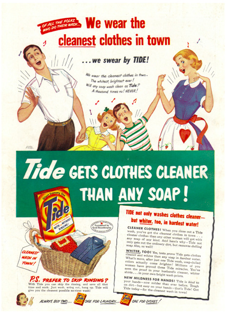
How can we turn this boring information into interesting advertising?
Here’s an approach that won a ton of awards for Saatchi a while ago:

Here, they’ve shown the fight against stains as a literal battle, and because of Tide, stains don’t stand a chance.
Let’s look at another example. We’ve all heard of date rape, and we
all know the importance of keeping an eye on your drink when you’re out
partying. Here’s a website that provides information about that topic.

I think we can all agree that this is not a successful piece of
graphic design. Whoever put this together was obviously well
intentioned, but it’s just a whole bunch of default font type on page
that’s never been touched by a designer. We can agree also that this is
not a successful piece of advertising, either, because all it does is
repeat familiar information. There is, unfortunately, nothing here that
would make people think seriously about how to protect themselves when
they’re out clubbing. But a London ad agency helped these people out
with an ambient idea that looked like this.
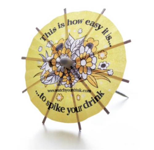
A team of people went out to clubs and popped these little umbrellas
in women’s drinks when their backs were turned. Suddenly, people were
confronted with the stark emotional reality that they weren’t as good at
protecting themselves as they thought they were. Suddenly, mere
information was delivered in a way that grabbed people’s emotions and
made them think about their behavior and how they might change it. So,
if you’re interested in becoming an advertising art director, ask
yourself if you feel able to come up with the kinds of ideas that turn
mere information into arresting communication.
It may be that some of you are thinking, yeah, wow, I want to get
into advertising. What should I do? Well, the good news is that you can
and should keep on doing exactly what you’re doing. To understand good
design principles, photography, typography, print production – all these
things are vitally important to your success as an advertising art
director, and I can tell you that advertising programs don’t teach these
skills nearly as well as design programs do. So you’re in the right
place, but you’ll need to do some extra work to prepare for your start
in advertising, and that extra work will be on your advertising
portfolio. Your advertising portfolio should not, ideally, contain
design pieces.
For your advertising portfolio, you need to start creating ads. Grab
images off the Internet or do your own quick photography and start
creating ads. The best place to start is with print ads, because they
give you your best odds of making a good impression quickly in the
context of a portfolio. To inspire yourself, go looking for an ad that’s
really bad. You won’t have to look long to find one. When you see that
bad ad, you’ll probably be able to glean from it what the brief would
have been – that is, what the advertiser was trying to communicate.
But if you don’t feel able to work without a formal brief, I can help
you there. If you go to the adteachings account on Scribd.com, you’ll
see that I’ve posted a bunch of clear, straightforward briefs for
several brands: California Sandwiches, Swiffer, the Royal Conservatory
of Music, Jolt Cola and M and M Meat Shops.
A word of caution: Your first portfolio will not be done quickly.
You’ll get started and think, “Wow, this is going well. I’m going to be
done in a couple of weeks!”

No, you aren’t. If you spend an hour a day on it, your first
presentable portfolio will easily be a year away. Good portfolios are
the result of endless revision, refinement and editing. You will know
you’re making progress when you realize that you’re discarding way more
ads than you’re including. And please be aware that your portfolio will
actually never be finished. I’ve seen advertising students and juniors
hang on to the same lousy ads for years and years, and since their
portfolios stay in the same crummy place, so do their careers.
If you’re looking for more inspiration, I would direct you to the
Internet, where there are all kinds of amazing websites devoted to
advertising. One of those is
mine.
Another one is
AdsOfTheWorld.com, which receives and posts pretty much every good ad that gets published or broadcast anywhere in the world.