The weirder you are, the better


All creatives were the weird kids in school.

That's what makes us creative. We see things differently. We look for alternate solutions. We create a new solution when there is none. And now we get paid to do it.

There are no new ideas, but there are new ways of putting together things to creative something innovative and interesting.

That's what a creative's job is.

So keep going on that quest to learn, experience and create "weird" things.

Be different with a purpose.

Cheers to all the weirdos!

Creativity: Why You Should Seek Out Unusual or Downright Weird Experiences

From PSYBlog

Weird
"Creativity comes from looking for the unexpected and stepping outside your own experience." ~Masaru Ibuka
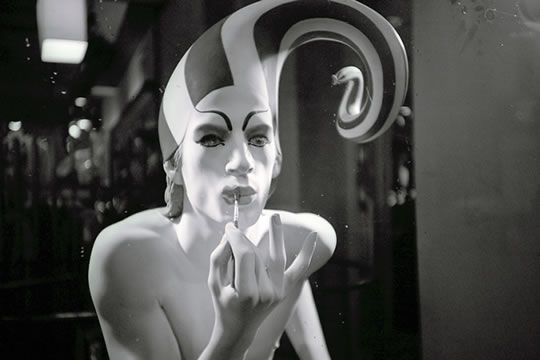
Creative people can be a little weird. Great artists are often outsiders: they don't behave like us, they don't look like us and they don't think like us.

True creativity is not the preserve of people who think the same as everyone else. Frequently (but not always) this is the result of lots of weird things happening to them:
"...highly creative individuals often experience a disproportionate number of unusual and unexpected events, such as early parental loss (Martindale, 1972) or having an immigrant status (Goertzel, Goertzel, & Goertzel, 1978). Furthermore, living abroad is linked to creativity in the general population (Leung, Maddux, Galinsky, & Chiu, 2008)." (Ritter et al., 2012)
So perhaps:
"...diversifying experiences help people break their cognitive patterns and thus lead them to think more flexibly and creatively." (Ritter et al., 2012)
Now there's experimental support for this idea. In two experiments Ritter et al. found that:
"...comparisons with various control groups showed that a diversifying experience—defined as the active (but not vicarious) involvement in an unusual event—increased cognitive flexibility more than active (or vicarious) involvement in normal experiences."
So go out this weekend and do something weird: it'll make you a more creative person (probably!). As former Beatle Paul McCartney said:
"I used to think anyone doing anything weird was weird. Now I know that it is the people that call others weird that are weird"
Just make sure you take an active part in the weirdness and you don't let the weirdness go too far.
We've all met people who are weird-bad rather than weird-good. A creative person may be intentionally weird, but only at times when weird is good.
Have fun!
Image credit: Norma Desmond

Inspiration: Unconventional Ads

Think outside of a full-bleed print or mobile app and you'll find a world of creative options for executions that win.

The Four Best Unconventional Ads From The Last Four Years
Via Copyranter

The Four Best Unconventional Ads From The Last Four Years

Inspired ambient advertising that perfectly combined medium and message.

In March, 2009, this 225 square meter sticker promoting Frontline flea and tick spray was placed on the main floor of three shopping malls in Jakarta, Indonesia. Brilliant. Ad agency: Saatchi & Saatchi, Jakarta.
Last Fall, in Toronto, a real street scene with blurred billboard, sidewalk, street sign, mailboxes, and fire hydrant was erected. It was promoting the Mercedes-Benz 2012 C-350 Coupe, and got lots of press. Ad agency: BBDO Toronto.
December 2009. Taking advantage of a country-wide snow storm in England, Polo mints, through their ad agency, JWT London, produced stamps that perfectly replicated the candy in snow, and hit the streets. Big return on free media. This is my favorite. So simple.
2009, via China, for Supor non-stick pans. The Shanghai office of Leo Burnett set up a giant wok outside shopping malls in the city. A ramp was placed behind it where skater boys and girls dressed as prawns, fish, pork, eggs, and carrots created the illusion of cooking non-stickiness. Pretty cool. Video below.

How to Copy Write: A detailed guide

Copywriting is a skill, an art in certain ways. It really hurts my feelings when students say they picked copywriting because it's easier.

It's not.

It's different.

You don't need to master programs, but you do need to master words. You need to know how to take boring client mandatories and turn them into an intriguing and enticing conversation with the target.

You need to know how to tease, excite and motivate people in an interesting way. Without cliches. Without being boring. Without saying too much. Without lying and getting sued/boycotted. Without saying something that's already been said. Without being confusing.Without snapping after going through 32 revisions of ONE line.

It's a lot.

It takes work. Practice. Talent. Resilience.

I was sent this gem last week and couldn't wait to share it with you.

The Copywriting Infographic 

It's huge, so you'll have to click/download to view all of it (Try this link). But it's great. I love infographics (have you seen Awesome-or-Awful.com?) and this chart is full of tips, tricks and how-tos.

Also these great quotes:

"A writer is someone who can make a riddle out of an answer." - Karl Kraus 

"When you write, try to leave out all the parts readers skip." - Elmore Leonard (!!!) 


 Save it. Print it. Study it.
(Try this link)

Praise vs Criticism

My co-worker has this on his wall (apparently he created it. He must be some sort of creative or something.) 

I love it because people (*ahem* especially younger folks) are always looking for praise and pats on the back and not as readily open and receptive to criticism and negative feedback. 

I've written about Dealing with Death and Accepting Feedback. But let's talk about it a bit more. 

Throughout school, working on your book, your first few years and your ENTIRE advertising career, people are going to tell you what you're doing wrong. Teachers, coworkers, creative directors, clients - everyone has an opinion about what's wrong and what could be better. 

I'm not saying you have to do whatever they say, but you should be able to listen to them. 

Being humble, accepting, understanding and, most importantly, being able to learn from your mistakes and become better will keep you employed. And keep your portfolio growing. 

Don't be mad because so-and-so didn't have anything good to say. Be thankful they cared enough to be honest with you about where you're falling short. 

A lot of other people would just sit and watch you fail. Or say "Never mind, she doesn't get it. Bring in What's His Face to do it instead." 

You don't want this. 

Try. Fail. Then try again. (Read: Fail Big and Fear of Failure

You're going to make mistakes. You're going to get it wrong. You're going to have to make revisions.


Find out what you're doing wrong. Find out how to fix it. Learn from it. Grow for it. Get better. 

Cheers to being torn to shreds. 

The only way to go from there is up. 

Type Star: Creative You Should Know

Closing out the week with another post on typography. And creativity. And someone who creates type. It's a cycle. Hopefully it inspires you to create something great - like the logo for a social networking site.

In case you missed the other posts on typography: Become a Type Snob and Type Snobbery Part II

Creatives You Should Know: Juan Carlos Pagan 
from Creativity Online


Self-professed typeface geek Juan Carlos Pagan had already made a name for himself long before he joined DDB, New York as a designer six months ago. The Parsons grad was busy indulging his love for typography at the inaugural Type@Cooper postgrad class at Cooper Union, when his friend and fellow designer Mike Deal called him to collaborate on a project. Little did they know, they were working on what would become, arguably, the creative industry's logo dujour, for Pinterest.

Pagan says the brief from Pinterest founders Ben Silbermann and Evan Sharp called for a logo with a custom typeface. The original featured Bello Script by Underware, "which is a beautiful typeface, but it's something that anyone license," he explains. "They wanted something that was nostalgic, but not overly nostalgic. It had to work on really small screens because most of the interaction with the logo would be on a mobile device or screens."


The process of creating the logo came naturally, and the pair was free to take creative risks, Pagan says. "Ben and Evan were really great at expressing what they were looking for and they have a high level of respect for craft and design. They see it and feel it and understand the significance of it.

That's the only reason we were able to do some of the things we did, like using a discretionary ligature, for instance." For non-typography geeks out there, he's referring to the ornamental connection of the logo's "s" and "t." Says Pagan, "That not only helped the logo feel right, but it adds that bit of craft and quality I think they were looking for."


The Problem with P
The biggest challenge? "We had this ongoing joke of getting the right degree of 'P-ness,'" he laughs, bringing out the twelve-year-old boy in all of us. Initially the pair believed that having the P mimic a pin would be a "little too obvious," he says. "The whole entire time, we were like, 'No, no pin. Let's just make a beautiful P and that's it.'" But toward the end of the project, they decided to give it a go.

"We didn't want to make it too sharp because that's evil. And we didn't want to make it too soft because then it would be a nub. It was really about nuancing the right degree of suggestion of 'pin,' and we got to a place where we were like okay, maybe it's a little obvious but it's okay because it feels right. If this P is going to have to live by itself, then maybe it should be a little more conceptual in that sense. I'm really happy with that decision because it really helps people interact with the logo."

Beyond Pinterest, Pagan has also worked as a designer at G2 and MTV, where he worked on the identity for MTV Scratch. Now at DDB, he's has applied his smart design and typography sense to the agency's work for the Art Directors Club, the New York Lottery, Hertz, including the latter's a standout poster campaign with a fun, art deco vibe, featuring a variety of slightly tweaked typefaces, courtesy of Pagan.

The posters featured illustrations from Studio AKA designer Chris Gray. "I took Chris' work and started really developing the individual typographical language for each poster. It could have been easy, you could have just had him do it and slap type on top, and that would have been fine. But I really felt that even though it was a campaign, each ad deserved a unique typographical voice. The typography relates to the art."

At Creativity, we've noticed that the work out of the agency has gotten a lot more interesting over the last several months. CCO Matt Eastwood and ECD Menno Kluin say Pagan is one of the factors behind the shop's creative renewal. An unusual creative process also helps. "Menno and I have weekly, if not daily conversations about the things we want to create, the people we want to work with and how that fits into our clients' needs," says Pagan. "And out of those conversations we approach creating stuff and proposing things to our clients. If they like them and if they're on par with strategy, we'll move forward with it. It's unique. We're a global agency, but here in New York, we act really nimbly. We act like a small design studio and I love that. We approach projects with this idea that we can make them.

When asked about his thoughts the state of design in advertising, "I don't think it's as bad as a lot of people think," he says. "The truth is I think a lot of things lie within mediocre. It's like a microcosm for society and people--10% are exceptional, there's 80% in the middle, and then 10% that's horrible. Design, in terms of advertising, a lot of it you're seeing is in that 80%. You're seeing it, but you're not really seeing it. You're not really engaged. I think we're striving here to do the top 10%."

Which, he believes, can not be reached on talent alone. "It's tough to excel to the top," he says. That's hard work. There are a lot of talented people in the industry, but I think the people who get to that 10% are people who have an extremely high aptitude for hard work."

When he's not killing himself over ads, Pagan tends to another outlet for his letter-driven obsessions, his own foundry Pagan & Sharp, launched with fellow designer Lucas Sharp.

Juan Carlos Pagan--More to Know:

If not doing advertising:
I'd be designing something. If I wasn't designing for advertising, I'd be designing something. I have a type foundry on the side with Lucas Sharp so on weekends and nights I'm designing typefaces and licensing them. I'd be doing that full time, or I'd be designing a building. I need to be making something on some level.

On what his family thinks of his career:
I had an interesting experience explaining to my grandparents what I do, but they don't quite get it. They get that I work in advertising, but they think typography just exists, that it's like air, which most people should, and it's fine.


On his favorite typeface:
I go through momentary fits of things I'm really drawn to. Right now, I'm really interested in Fleischmann and William Addison Dwiggins and his M Formula, which kind of informed my latest typeface. It involves really sharp points on the inside, the counterforms, and these really round smooth points on the outside, and the tension and contrast they create and how they read when they get really small. That's really fascinating to me.

Little known fact: I have a pretty extensive library of books. I read a lot of philosophy, whether it's pre-Socratic Greek or postmodern existentialism--that sounds shitty, but I read a lot of philosophy. Maybe that's weird for a designer.

E-reader, or book?
I like books-- a lot. I romanticize reading a book. I love holding the book, smelling it. I love being on the train on a cold Winter's day with a cup of coffee and a book. I can just ride the train back and forth. There's something soothing about that.
My roommate has an iPad and he reads on it and it seems wonderful. I'm not hardened. I have an iPhone, I read and write emails on it, but I do enjoy the book, the page flipping, making creases. My room is books, it's like my bed, my computer and books.

Skin Colour Does Matter

Art directors, designers, photographers and retouchers REJOICE! Pantone now has a skin tone guide.

Hint: Be sure to include people of different cultural backgrounds in your work. It's not 1952 anymore. America is full of colour and your creative should reflect that.

Official: PANTONE Unveils A Collection Of 110 Skin Shades 

From Kiss My Black Ads


Global color authority PANTONE has unveiled the ‘PANTONE SkinTone Guide’, an official collection of 110 shades of nude. 

The collection hopes to be a standard for matching skin color, and can be used where skin tone needs to be accurately matched to a color standard.

According to PANTONE, the guide can be of many uses, such as in: Product design, to develop and control natural skin tones for toys and a variety of products and accessories; Photography, to easily match skin tones for accurate photo editing and retouching; Print/Packaging/Graphic Design, for quality control standards for consistent and appealing skin tone reproduction.

“The guide will help take some of the guesswork out of the color correction process by providing our experts with a defined system for reaching skin tone color targets, saving us time and eliminating costly mistakes,” Victor Basile, senior vice president, director of print graphic services at Publicis Groupe, said in a statement.

The SkinTone Guide has 110 pages, each dedicated to its own SkinTone shade for accurate visualization—each page has a small circular cut-out for users to compare the sample to the PANTONE color.

To create the guide, several high-end spectrophotometers were used to ensure precision, and more than 1,000 human skin tones were scientifically measured and collected from a diverse range of ethnicities and age groups.

“The semi-translucent nature of skin makes measuring and reproducing skin tones in print and manufacturing an extremely challenging process,” Giovanni Marra, director of corporate marketing at PANTONE, said in a statement. “By starting with actual skin tones and working back to define a SkinTone color space, we were able to catalog the most realistic and reproducible skin tones.”

“In most other color palettes, the color ‘nude’ is unfortunately relegated to a few skin colors, but in reality, nature has given us a multitude of beautiful shades of skin,” Marra added.

The guide is arranged from light to dark and utilizes a four-digit alpha-numeric system: the first two digits reflect the hue or undertone of the skin; while the second two reflect the tone or lightness and darkness of skin.

The PANTONE SkinTone Guide is available on Amazon at US$89.

School vs Work: What I learned my 1st year out

Here are some tips and tricks from a junior art director after her first year working in an agency. 

You may be surprised by what she's learned. 

Use it to help make yourself better.


5 things you didn’t learn in school that you learned in your first year as a junior

1. You probably won’t like your first (second and third) year in advertising.
To be clear, this is not a ploy to deter people from a career in advertising. It’s just a way of saying you’ll either hate it and/or love it.

2.  Be vocal about your needs in order to do the best work possible.
As a junior, you don’t want to complain and look incapable of dealing with something on your own. But sometimes you should actually address a real issue. Project requirements, timelines, the brief, work relationships, etc. Just because you’re at the bottom of the food chain doesn’t mean you have to bend over and take it. After all, juniors are human too.

3. Step back from advertising.
It’s not easy because if you go from ad school straight to an ad agency, advertising IS your life. But advertising that’s inspired by other advertising is actually really tragic. Unsubscribe, turn things off, go outside, and force yourself to be inspired by life.

4. It’s okay to not stay in this industry.
Of course some people do want to stay in the industry (which I’m actually really envious about because they’ve found their life’s calling). But so many people talk about doing improv, writing scripts/screenplays, having a gallery show, creating a fashion brand, procreating, fighting Voldemort and saving the world. So work hard, save up that money, and go follow your dreams.

5. GOOD WORK > MORE MONEY.
Always. What if something happens at your agency and you get laid off? Would you rather have good work in your portfolio to help you find another gig? Or bad work in your portfolio but some money to wipe away your tears? Good work will eventually lead you to more money.

5 things that school prepared you for

1. Presenting.
I was actually surprised at how many people don’t know how to present. Here’s some quick tips I learned during school: Keep it short, concise, and confident. Make it your own so you’re telling a story versus selling something. Put only the necessary basics on presentation slides. Take advantage of pauses. Know your work so you face your audience and don’t read off a wall with your back to them. Remove all “Uh… um… yeah…like…” from your vocabulary. And NEVER start a sentence with “So…”

2. Understanding strategy/strategists.
I gained a lot of respect just by reaching out to the strategists to learn what their original thought process was. Sometimes their explanation changed my mind and I would get inspired. Other times, we’d talk it through to push it to a place where we all felt strong enough to move forward. It helped me to learn how to be push the work respectfully and present strategy, which apparently many creatives don’t do.

3. Socializing is half your job.
I was pretty friendly before Brandcenter. But I once I got there, I was faced 200 new friends at once with presentations, crying, laughing, massive eating and drinking sessions with people from all over the world every week for 2 years. It was pure madness but amazing at the same time. It definitely prepared me for the ad world.

4. The stress.
A professor once told me, “Don’t stress out. It’ll eventually make you hate the game of advertising. And once you hate it, you’ll never come back.” It’s sound advice.

5. Fail.
Pitch your best and craziest ideas, even if they’ll fail. At least you tried. Don’t be predictable and safe. This is one of the few industries where we have the freedom to do that. Take advantage of it. You want to be Mozart and not Salieri.
 

Typography Snobbery Part II

As a writer, I love seeing my words look amazing.  Here's another post dedicated to type and the snobs who love it.

Typography and its Immense Importance for Your Designing
from dzinepress

typography-art-designing-530


Among different elements of graphic designing, typography is an important one, which the designers usually take for granted. Typography in terms of graphic designing means to choose the kind of font type that completely blends with the design and speaks for itself as a part of that design.
In technical terms, typography is the art of arranging font type into the layout of the design. This arrangement includes the selection of typefaces, point size, line length, line spacing and the adjustment of spaces between groups of letters and between the letters of a word, all together constituting typography.

What is Typography?

what-is-typography
To explain the phenomena of typography, it can be said that it is basically the order of shaping written information. Typography can be applied to anything which has to do with text, including captions/headings, names, web design or any kind of written information. For instance, authors or writers write the text of their books, designers or typographers manage the typography and the end readers read through it.
Going deep into its etymology, the word Typography comes from the Greek origin words typos, which means “mark, figure” and grapho, which means “to write.” So as a compound word, typography means to write in a specific mark or style, and that is pretty much self explanatory for typography’s true meanings.

Significance of Typography in Graphic Designing

Typography-in-Graphic-Designing
Significance of typography is unrivaled when it comes to graphic designing. Typography is a particular design element without which every design seems incomplete. There is no rocket science involved in it, for which we need to follow a set pattern of rules and regulations. However, what you do need is a sense that matches the perfect typo for your design (because every type cannot be used for any design).
It won’t be unjust to confess that typography plays a major role in making any graphic design an instant success. By conveying your message visually with typography you can save yourself a lot of time keeping in the bounds of creativity. With type you can jump right into things without having to extract, adjust levels or curves. However, sometimes the combination of color and typography is overlooked, which affects the overall project.
Typography is something that many designers take for granted and shift their focus on the more pictorial aspects of design like the image or layout etc. Also to be noted that typography can be one of the factors in your work that will be immediately noticed and valued in your portfolio when applying for jobs in the field, especially when it come to advertising industry.

Significance of Typography in Web Designing

Typography_in_Web_Design
Similar to graphic designing, typography has an inevitable importance in the field of web designing as well. Almost 90 percent information on the web is based on writer material and thus involves typography. Basically, web is a medium where typography rules are to create a package of readability, coherence and visual satisfaction that engages the readers in their unconsciousness.
The limited choice of fonts and typos on the web should not be a designer’s major concern. A skilled web designer can use what is available and make the most out of it, keeping in mind that readers do care about how the text is represented. The web readers might not care about the typography itself; however what they do care about is to get and understand the right information quickly and easily.

An Important Example – Effects of Bad Typography

bad-typography
Most people I have seen belonging to the media and communication industry largely undermine the importance of typography. For such people, typefaces are pretty insignificant. However, to the true devotees of typo, they are the most important feature of text, giving subliminal messages that can either tempt or revolt the readers.
An example of how a bad typography can effect the onlookers is when Avatar, the biggest grossing movie of the year 2009 was released, a particular section of the audience was immediately outraged, and those were the graphic designers. Reason being, they didn’t like the font that James Cameron had chosen for the subtitles. There were several angry views about the bad typography used in Avatar such as:
One blogger commented “I hated it on the posters and then threw up a little in my mouth when I realized I would have to read that ugly font throughout the film in the subtitles,” Another said, “After the hundreds of millions of dollars spent on CG effects, did he just run out of money for a decent graphic designer!?!?”
This example is fair enough to make you realize that the fonts and particularly good type fonts are not just for designing geeks. Any medium of communication need a good typography for its success.

In Short…

typography-in-short
Typography is immensely important for designing (both graphic and web designing). Great typography is a state of mind which comes with experience and right knowledge.  You can gain a lot of knowledge regarding typography by getting to know of other’s experience.  Observation can play a crucial role in adding to your knowledge of typography.

Typography Art in TV

typography-in-tv2

Typography Art in Poster Designs

typography_in_poster

Typography Art in Ads

typography-in-ads

Typography Art in Flyers

Typography-in-Flyers

Typography Art in Outdoor Signs

typography-outdoor-ads
Just study typography around you; in print, TV, ads, brochures, flyers, posters, outdoor signs, entertainment packaging, billboards, books, the web and any other medium you get to see. Typography has one plain duty before it and that is to convey information in writing with a style, and that’s what the designers should keep in mind in order to produce successful designs.

But Are You REALLY Ready To Work?

Originally posted July, 18 2011 
Felt particularly relevant to me today. And hopefully you, too.


Time to grind. Are you ready?

I hope I didn’t scare you off on Friday with some of the challenges of being a creative. I did it because I love you. Truly. I want you to be great. And knowing what to expect and how to prepare yourself for it is going to help you be great. (Also, I’m a bit of a bully.)

I just want you to be prepared to work hard and give 108% to be successful. 

You have to know the hours can be long and the projects can be hard and you will have challenges and sacrifices. You have to be willing to put in the work to get to where you want to go. 

No one owes you anything.

No matter how good your book is, what award you won, who you know or where you went to school. No one owes you a reply to your email, feedback on your book, an interview
Shoot I don't owe you this next sentence.

You have to prove yourself. You have to show that you are capable and worthy. 


It’s important to have your current/future coworkers like you (Read up on why you should go for a drink with them) but it’s even more important to have them respect you.


And respect is earned.

That’s why I’m always surprised (and turned off) by young creatives with egos and attitudes. Maybe you were the next best thing since wi-fi at home/school, but in an agency, you’re a small fish at the bottom of a big ocean and you have to show that you deserve to be here.

Can you deal with the pressure? The deadlines?  The process? The clients crushing your dreams? Can you work with a partner? A PM? Do you even know what a PM is?

This is why internships and freelance are so important. The more familiar you are with how an agency is run and the more intimate you are with the work process, the more successful you’re going to be. 

It's not enough to be creative (don't be a cliche.) You have to have an edge.


That's why posts like how to stand out and how to promote your personal brand and the art of emailing and books like Breaking In are so valuable.

That’s why becoming intimate with hard work is even more valuable.


There are a million juniors out there. Why should anyone pick you? And if they do pick you, why should they keep you?


People get laid off and fired left and right in agencies, how do you ensure that you are not called into that dreaded meeting? (Outside of putting on your invisibility cloak. I got mine on Amazon.)


And don’t get me wrong, advertising is fun. It’s a great industry to work in. When you win, you win big. But it takes a long time and a lot of work and a bit of luck to get that win. There are at least 4 failures for every win. And a lot of weekend work and missed lunches and cancelled dates.


So start working hard now. Put your all into school, into building your book, into promoting yourself, into your job hunt and into being a student of advertising.

People will see it and think, "Oh, she would put that kind of passion and tenacity into the work we're doing here."

Get internships. Get freelance work. Practice working with a partner. Working with limitations. Get involved in ad clubs and ad organizations. Get as much experience as possible.


Today is Monday. What are you going to do today?


Friday Treat: Make Ads Like This

Thank Oprah it's Friday!

Here's your treat. Ads of the Worlds Top Ads of July

Here are the Gold winners:

Best Film 
UNICEF: Costume


Best Print 
Bench Fix Hairstyling Products: Gecko


Best Ambient 
Fantastic Delites: How far would you go? - Delite-o-matic


Best Outdoor
Misereor: Power of a Coin

Best Online 
McDonald's: Passion Meter

Best DM 
Beate Uhse: Face Bra


See the Silver and Bronze here

Become a Type Snob

All art directors and designers need to know how to work with type. I would repeat it or put it in bold for emphasis but I want you just to take my word on this one.

Knowing what to pick, how to use it and how to lay it out will make you an incredible asset in any agency.

Start becoming a type snob today.

There are a million and seven sites that feature and celebrate great type. Here are a few that I like.


Typography Inspiration & Information

Type Flirt, a collection of typography with flirty sayings.


               _______________________________________________________________


Typography Served, a gallery of curated work from creatives on Behance.


               _______________________________________________________________


I Love Typography a showcase of great typography, typefaces and type treatments.