It Aint Easy Being Creative

People think advertising is easy until they actually have to do it.

It looks fun, but there is some science - and art - to it.

Recently, after going through several rounds of feedback and revisions -- about two minutes before I'd start pulling out my hair - I had the clients sit with me and said "Let's figure this out together."

I wanted get better feedback so I could properly solve their problems. And more importantly, I wanted them to see my frustrations.

Within the first ten minutes, they were both frustrated. One even said "It's like we're stuck in a box."

I wanted to hug her. WELCOME TO MY LIFE!

Eventually, we found a hole and were able to get out of that box and while it was only a small part of a big project, we all kind of wanted to throw confetti.

I can't always trap the client in a room until we figure something out, of course. Sometimes you just have to try and fail. Then try and fail. Then try and fail again.

But when you do get it (If you get it) it feels like bathing in champagne waterfall at the end of a double rainbow.

Here's a snippet from Art & Copy talking about how the teams came up with "Just Do It"

It wasn't easy. But they did it. And it was (still is) brilliant. 

Common Portfolio Review Mistakes

Love this post on Dear Brook (a blog for juniors written by a junior) that covers 5 common mistakes creative wannabes make at portfolio reviews.

I definitely have seen all of these in action and have actually stopped a review to give similar advice.

Are you guilty of any of these?


5 common mistakes Juniors should NOT make

28130424
Last week, I attended "Where are all the black people" event  and while there were some amazing panels about diversity and young creatives in advertising, I got to review tons of Juniors' portfolios and I met some amazing people in the process. For a while I was the person getting their portfolio reviewed (and still am actually) but for one day I got to see what it's like to be on the other side of the table. First of all, I applaud all the young creatives who were so enthusiastic and received constructive criticism so gracefully; I know it's hard, but you guys are on the right track I promise! One more push and you'll be enjoying nights and weekends at your new agency :D

During the event, I also got to see the common mistakes Juniors make while getting interviewed and presenting their work. A couple of months ago, I wrote a post about networking, which you can revisit. In case you don't know yet, networking is very important and apparently, it's an Art.
Now back to those common mistakes. They are common because A LOT of people make them, don't be one of them. Ask yourself honestly if you make any of the following 5 common mistakes:

1- Eye Contact
Man, that is the worst one for me. If you're sitting in front of someone who took the time off their busy day to come meet with you and help you in your career, the least you can do is PAY ATTENTION when they talk. I understand that a lot of young peeps are ADD, I'm ADD! But come on, show some respect and look at them in the eye. I can't stress it enough, it is such a turn off. This actually happened to me during the event, and for some reason I remember the guy with the wandering eyes very well. Now, that's not how you want people to remember you, do you? F-O-C-U-S

2- Overconfidence
Juniors who think they are the S#*t, yep they exist. A Junior by definition is someone who is starting, who is a beginner hence they don't know S#*t. Being confident is great, being overconfident is simply annoying. Here's the thing, when you're overconfident, you automatically think you know it all, and when you think you know it all you don't have an open mind, when you don't have an open mind, you don't learn anything and when you don't learn anything, you stay a Junior who doesn't know S#*t. Nice little picture I drew for you there huh? Be confident but stay humble.
ADDED BY @THEDAWE: Arrogance is a big one. If you're great, don't worry, you'll have plenty of opportunity to show it, not preach it. 

3- Lack of practice
When you go interviewing, you really have to practice your elevator pitch. You gotta know what to say, when to stop and listen and how to answer questions. I had people sit down and hand me their portfolios and wait for feedback. BOOORRRINNNG! I'm already not interested in your work. When you come to interview or show your folio, you have to be ready to speak, show your personality and walk them through your work. People are not going to understand the thinking behind your work unless you tell it. Think of it as storytelling. Go in there, talk about yourself, how you got to where you are, say an anecdote or two, tell them about your work and walk them through it. DON'T EXPLAIN YOUR WORK, just walk them through it. Then ask for feedback, take notes, exchange business cards, thank them for their time and ask if you can connect in LinkedIn later. Then follow up with a written card.
Practice is crucial Juniors, the more you practice, the more you feel confident and the more they'll like you. I talked to some international students–and while I understand that language can be an issue because english is not my first language so I'm on the same boat– It's really hard to communicate with someone you don't understand. So my advice to you guys is to speak loud enough to hear and really practice what you're going to say 100 times. We're in the business of communication and if you can't communicate properly, it will be an issue.

4- Portfolio format
I was SO surprised by the amount of people who brought an actual printed portfolio. I thought those things were long gone? I guess I was wrong. I think 80% of the people I met with had a printed portfolio. Some people will say that there's nothing wrong with a printed portfolio but I disagree. I think a digital portfolio is the way to go. Unless you have some amazing printed art or designs or letterpress or something like that, then go digital. It's cheaper, easier to manage and you don't have to carry it around! Speaking of digital, I was also surprised by the amount of juniors who had only print pieces in their books. Some of them are great ideas that can easily be expanded into digital pieces. My advice to all of you is: Think Campaigns. Show the way you think, explore new and untapped mediums, go all out. Don't do what agencies are doing now, do something different that no one has thought about yet. it's easier said than done, I know. But give it a try.

5- Lack of focus 
I understand that sometimes Juniors don't know what they want, they are not sure if they're creative or account or media etc. BUT! when you apply for a job and go for an interview, make sure you don't come off as "Mr know it all" or "Miss I have no clue what I want". I guarantee you won't get a job like that. There are many articles, books, blogs about advertising, it's not that hard to learn about the different departments. Before you go to an interview, make up your mind. Learn as much as you can about the position you're applying for and see if that's something you want to do, if the answer is no, then don't apply. It's a waste of your time and the agency's time. If you need help or advice, seek mentors, ask questions before you start intervewing, that's what I'm here for. On the other hand, don't act like you know it all (Read 2- Overconfidence above). One guys was like, yes I'm a creative, but i can do startegy and consider myself a producer... i was like, dude, pick one, you just listed 3 departments. Don't be that guy. If you can't choose, try to get an internship where they'll let you intern in different departments. You'll eventually find what you want to do.
Overall, I had a blast at the event and I met some really talented people. My last advice to you all is to be fierce. Go get them. Speak up, don't be shy. Go after what you want because if you sit there and wait, it'll never come to you.

Love,
Brook

Making Lemonade

As a creative, you don't always get what you want. (Kinda like life)

You come up with a kick-ass idea and your partner doesn't like it, or your boss changes it, or the account team kills it. And if it makes it to the client, you better hold your breath.

The thing is, sometimes the clients don't necessarily hate what you present. They may even love it. But then they start telling you all these things to change, add in or take out that in the end, strip your kick-ass idea of the kick.

There are several ways to deal with this.


Make two -- a version the way they want and one the way you like and show them both and see if seeing it in real life sways them. (It may not. So be prepared for that.)

Do a version for your book. Make it how you like it and though it may never be seen by the masses, at least you love it.

(Sometimes agencies do "agency versions" for TV spots that are different to the one that is actually produced and shown on air because they like that better.)

Create a tumblr with cool designs showing off the ridiculous feedback you've gotten. Like the folks at Heard Back From The Client

It's funnier when you look at it this way and makes it easier to accept and move on.

Just do it. Whether or not you agree with the feedback, you have to find creative ways to work with and/or around the requests to make something that works. After all, that's what you get paid to do.

Here are two of my favs from HeardBackFromTheClient.tumblr.com


How To Be Wanted

There's no doubt in this industry you have to have the skills to stay afloat, but you also have to have certain qualities to rise above. 
Here are 5 of those qualities. I highlighted my fav parts and included links to related BFFC posts. (BFFC is what all the cool kids are calling Baby Food For Creatives. I overhead them talking about it.)

5 Qualities Every Creative Employer Seeks
from DesignTaxi


This is a cross-post from Source.

Sometimes it may seem as if the odds are against you when applying for a creative job. While it’s true that you’re likely up against stiff competition when interviewing for a position, know that there is a fulfilling place for you in the industry.

Wendy Burrows heads up the Integrated Client Services recruitment team at Source in London. She specializes in recruiting account handlers for London’s marketing agencies—from Account Executives to Heads of Client Services. In this post she shares the five vital qualities creative employers seek when fulfilling their positions. Develop these five characteristics within yourself to dramatically increase your chances of landing that dream creative job:

  1. Diligence
    Your potential employer needs to know that you’re thorough and will go through your work history with a fine-toothed comb. In this economy, an employer needs to know that she’s getting her money’s worth from the salary that she’s paying you.
    • It’s an employer’s right to seek diligence in his employees. Whether you’re being offered a position that pays £10 per hour or £100,000 per year, you need to bring all you’ve got to the table.    BFFC Post: But are you ready to work?


  2. Professionalism
    Employers seek professionalism in their employees because it gives them peace of mind that they’re making the right choice. You should dress professionally and appropriately, carry yourself with confidence and know exactly what you’re talking about before you say it.
    • A professional demeanor goes a long way. A professional demeanor, firm handshake and killer interview outfit just may get you the creative job you want. When you display professionalism, you give interviewers the comfort of knowing that they’re making the right decision.

    • Many employers promote within the company. If you lack a professional demeanor, you’ll likely be looked over because interviewers will see little potential for your advancement within the company. You’ll come across as not worth the long-term investment. BFFC Post: Develop A Split Personality


  3. Dedication to success
    A perfect employee is a go-getter. The ideal employee for a creative job is willing to move mountains in order to attain success for themselves and the greater good of the company. And, if the mountain is immovable, they’ll willingly climb over the mountain or bore through it to get things done. They are problem solvers not problem creators.
    • The perfect way to showcase to an employer that you’re dedicated to achieving success is to bring testimonials from your previous employers, clients, and colleagues.

    • Bring along your portfolio of your most rewarding work. Explain how you went above and beyond the call of your job and give them ideas as to how you can do the same for them. BFFC Post: Do You Want Fries With That?


  4. Experience
    In the creative world, experience sells. Sure, a recent college graduate can provide a sense of excitement and a new spin on the ordinary. However, unless you’re vying for a job in an environment that thrives on new ideas, this is of little use to the employer. In addition, new grads must endure a learning curve, and that learning curve will cost the employer money.
    • A seasoned professional is preferred because they’re already trained to do the job and prepared to handle potentially sticky situations. An experienced professional can save employers money and also begin bringing in revenue almost immediately.

    • Even if you’ve just graduated, show the interviewer how your experiences can benefit the company in which you seek a position. BFFC Post: Freelance 101 and Internships Matter


  5. Education
    A relevant education is a mandatory requirement in such a competitive job market. Because there’s such a shortage of job openings and an abundance of applicants to go around, employers have the ability to hire overqualified applicants while still paying a lower salary. Keep up to date, keep your skills up to date and don’t be afraid to attend a course to enhance your existing skillset. BFFC Post: Portfolio School or No Portfolio School?


You deserve to be paid a great salary for your work. And, in turn, your employer deserves to hire the right, qualified candidate. Convince interviewers that you’re right for their company, with the right attitude and you’re sure to get multiple creative job offers.

BFCC Post: How Much Are You Worth

Why Should You Care About Typography?

by friendsoftype
I selfishly post things about typography because I like to see my words looking good. And I hate art directors who shun long copy or copy-driven pieces just because they don't know how to work with type.

Somewhere deep down, I'm also doing it for you. Because I want you to be aware and I want you to be better.

But this is mostly for me.

Infographic Of The Day: Why Should You Care About Typography? 

from FastCoDesign 

If you think typography is simply about personal whim, you just haven’t been looking at it the right way.

I have a confession to make. There was a time, many years ago, where I thought that typography was fashion by another name. I didn't really appreciate how different typefaces function, and how the discipline evolved over time, under pressure from aesthetics and technology. And it makes me particularly red-faced to remember that I once flaunted that ignorance, going so far as to tell a noted creative director that bit about type as fashion. If only I'd known! If only I'd had this infographic!

Created by someone who only calls themselves Noodlor, it does a pretty superb job laying out the basics of typography, such as the common types of faces, ranging from regular to condensed, and the anatomy of letterforms. There's also the very keen nugget of wisdom that 95% of graphic design is actually typography. But where it gets really good is in the "What It's Saying" section -- which should serve as a slap in the face to anyone who thinks like I once did:


From there, we get into more subtle territory: The basic principles of layout, which begins with the basics of direction, contrast, and rhythm:


"Don't try to be original, just try to be good" -- Spoken, originally, by a master of typographic clarity, Paul Rand. And one to remember, always

Posters for Designers

Long live white space.

From GlantzDesign

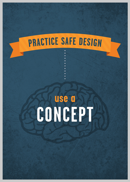
Poster#1: Practice Safe Design

Practice Safe Design

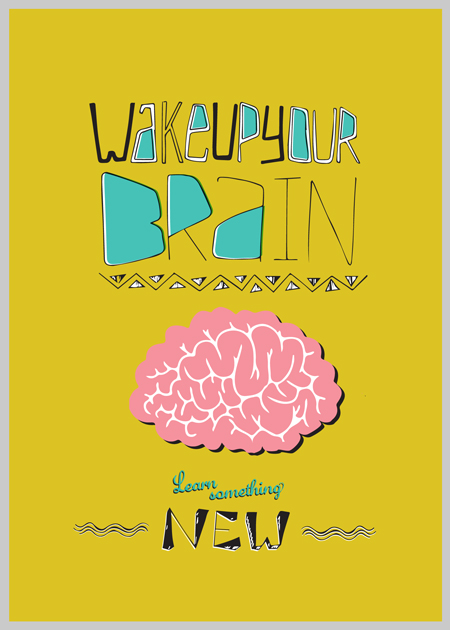
Poster#2: Wake Up Your Brain

Wake Up Your Brain

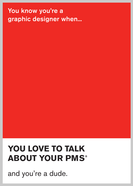
Poster#3: PMS

PMS

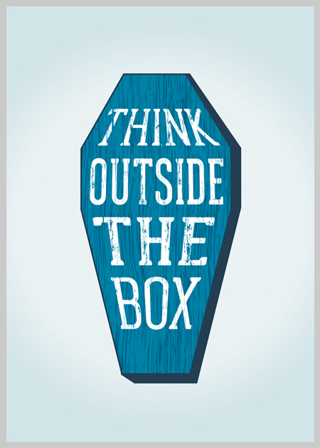
Poster#4: You’ll Have an Eternity to Think Inside the Box

You'll Have an Eternity to Think Inside the Box

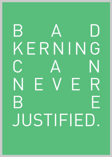
Poster#5: Bad Kerning

Bad Kerning

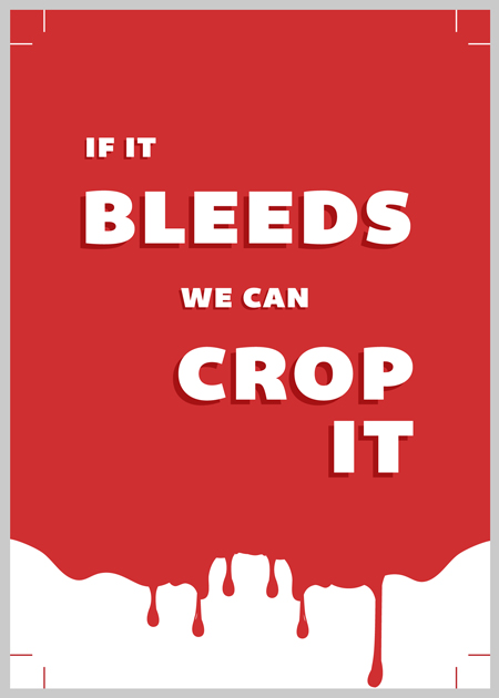
Poster#6: If It Bleeds…

If it Bleeds

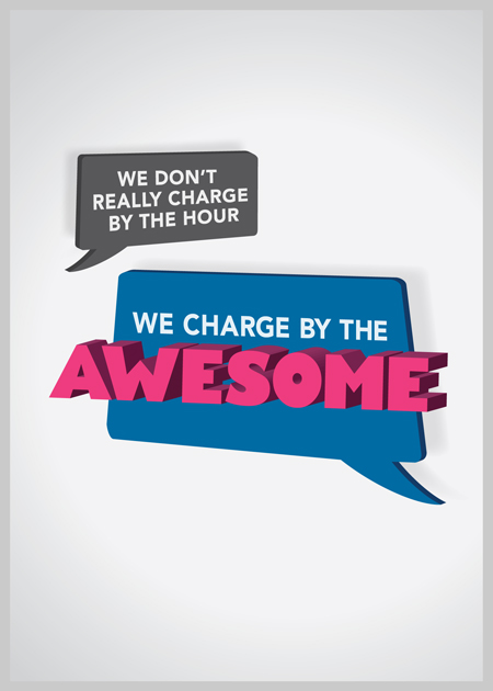
Poster#7: We Charge by the Awesome

We Charge by the Awesome

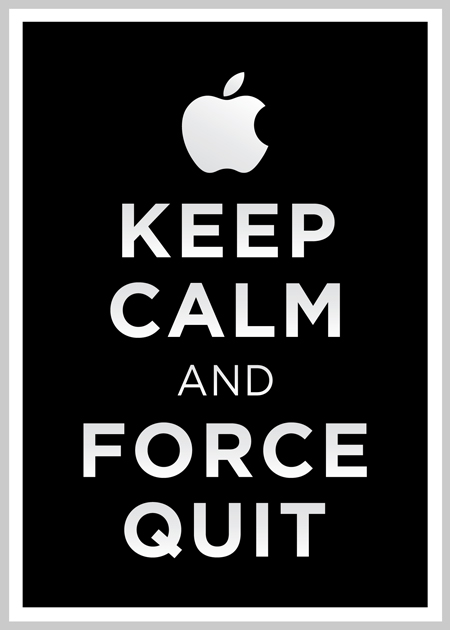
Poster#8: Keep Calm and Force Quit

Keep Calm and Force Quit

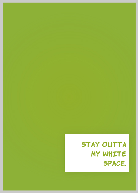
Poster#9: Stay Outta My White Space

Stay Outta My White Space

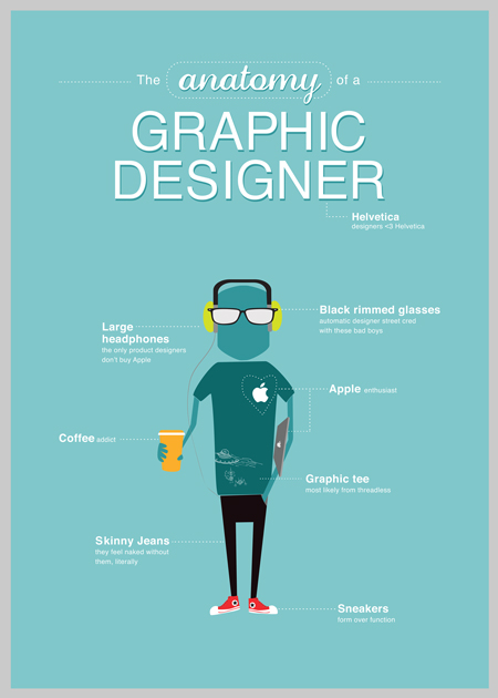
Poster#10: Anatomy of a Graphic Designer

Anatomy of a Graphic Designer

Inspiration Round Up: Best of Sept


Sometimes you love advertising. Sometimes you don't. 
Sometimes you feel inspired. Sometimes you don't. 
Sometimes you get it. Sometimes you don't. 
Sometimes you feel like a nut...  

Looking at the cool shit that's out there always makes me feel better and motivates me to make something. 

Here is AOTW's round up of some of the best pieces of advertising for September. Hope it inspires you too. 

Enjoy.
 

Ads of the World September 2012 winners

from Ads of the World

Best Film

BBR Saatchi & Saatchi Tel Aviv: So what is Integrated Advertising?

Gold

Mix Brasil Association: Father

Silver

Philips Azur Iron / Philips ProTouch Steamer: The Art of Ironing

Bronze

Best Print


Visa: Stanley Cup playoff beard

Gold

Santher: Musician

Silver

Arjuna yoga centre: Woman

Silver

Best Ambient


URA.RU: Make the politicians work

Gold

AV Chiado / Turismo de Portugal: QR Code

Silver

Lux: Magic Shower Rooms

Bronze

Best Outdoor


Secretaria de Saúde de Pernambuco: 360º Blood Poster

Gold

Quebec City Magic Festival: Sliced Girl

Silver

Barmer Gek: Fat Posters, 5

Bronze

Best Online


Virgin America: Experience Virgin America

Gold

Mercedes A-Class: Behind the Sites

Silver

Popcorn Indiana: The Popinator

Bronze

Best DM


Coca-Cola FM: Magazine Amplifier

Gold

Boh Camomile Tea: Calm Tea Bags

Silver

Clavin: Erection Blister Packaging

Bronze

Art Director vs Designer: Which are you?

Are you an art director or a designer?

I see lots of student books from people who call themselves one, but are really the other. Usually it's designers who want to wear an art direction hat.

Not that there's anything wrong with that - but if you apply for a job as one thing, and the employer is looking for that one thing, and your book doesn't show you're the one thing - then you're not going to get hired.

So you either need to change your title, or change your book.

Is my mind, I see it as Art Direction = Why and Design = How when looking at a creative piece. Art directors tend to think more strategically about the brand, the business and the concept, whereas designers are more about the look, the feel and the beauty of it all.

Not saying that designers aren't strategic or that art directors shouldn't focus on the details, but that's my quick litmus test.

Also, designers usually work solo while art directors pair up with a copywriter and are (in my opinion) more open to collaboration and feedback.

I asked my bff Google, and here are some snippets from an article I came across:

Art Direction and Design
from A List Apart

...Art direction gives substance to design. Art direction adds humanity to design...

...Art direction brings clarity and definition to our work; it helps our work convey a specific message to a particular group of people. Art direction combines art and design to evoke a cultural and emotional reaction. It influences movies, music, websites, magazines—just about anything we interact with. Without art direction, we’re left with dry, sterile experiences that are easily forgotten...

...Art direction is about evoking the right emotion, it’s about creating that connection to what you’re seeing and experiencing. By contrast, design is the technical execution of that connection. Do these colors match? Is the line-length comfortable for long periods of reading? Is this photo in focus? Does the typographic hierarchy work? Is this composition balanced?...

Here are a few suggestions on how to approach design and art direction, as you discern the differences in your own work:

-->
Approaching art direction and design differently
Tool
Art Direction
Design
Color
Does this color scheme fit the brand? Is it appropriate for the situation? Bright colors may not fit a sad message.
Do these colors look good together? Are they vibrating? Is each color the best choice for the medium, e.g., Pantone swatch for print, web-safe online?
Typography
What does this font connote? How do the letterforms themselves send the message without the actual words? Comic Sans might be too silly, but Helvetica might be too vanilla.
Does my assortment of type sizes create the right visual hierarchy? Does this font have enough weights to be used in this context?
Composition
How balanced should this composition be? Balanced compositions are pleasing but often passive. Unbalanced compositions are often uneasy and unsettling but visually more interesting.
Are my margins even? Is there a natural rhythm in the visuals that will guide a person’s eye through the piece?
Concept
How well do the visuals support and convey the mood of the brand? What is the message or story the design conveys?
How well do the visuals align with the brand guidelines for logo spacing, appropriate typography, and color palette?
Overall
Does it feel good?
Does it look good?

Read the full article (it's really great) here

Here are some quotes from the article I really liked:

Design is about problem-solving, whether you are a designer or an art director. The two roles differ in that the designer is more concerned with execution, while the art director is concerned with the strategy behind that execution.”
Phil Coffman, Art Director, Springbox
Design is the how. It’s the foundation of all communication, the process and production of typography, color, scale, and placement. Art direction is the why. It’s the concept and decisions that wrap itself around the entire product.
“Outside of this, it’s involvement, perception, and politics.”
Jarrod Riddle, Sr. Art Director, Big Spaceship

Win This: Young Glory

Entering Young Glory requires just two simple steps.
  1. Create your response.Your submission can be in any format (e.g. YouTube, Vimeo, Slideshare, .pdf, .jpeg, website...). Whatever it takes to communicate your idea in the most powerful and succinct way.

    The only rule is you must be able to link to it online via a URL. The URL can be under any domain (e.g. your own portfolio site), as long as it is not password protected.
  2. Enter & PayEnter your information and pay the entry fee via the secure PayPal form below. It is USD $10 for each entry you submit.

Portfolio School or Not to Portfolio School?

By Tintin44 - Sylvain Masson
That is the question.

My answer is yes, go to portfolio school. But I agree that's not the answer or an option for everyone.

Truth be told, I'll be paying my student loans back for another 100-150 years. I'm okay with that though, because this is America and education is expensive. I signed up for that when I moved here.
Plus, even President Obama had student loan debt. I consider myself in good company.

Outside of money, I can't think of a good reason not to go to portfolio school.

It's a 2 year boot camp program that whips you into creative shape. When I look at my book before I went into portfolio school vs after - wow. I remember when I was going into my 2nd year and it hit me, I get it now. It's like my first few quarters were practice, training daily.

I hated 1st quarter because it felt like Finger Painting 101 but I get it now, it was Idea Building 101, kinda like Thinking 101 - only you had all these people around you who were also "The Most Creative One" wherever they came from, so the competition and standards were different.

By 5th and 6th quarter I was more agile, sharper, smarter. And my last two quarters were mainly refining my book and networking. And working. Don't let anybody tell you you can't do both. I worked retail, hosted and bartended throughout my two years at portfolio school.

Portfolio school teaches you creative advertising - or how to be a creative in advertising. And it actually trains you on how it works. Getting a project, coming up with ideas, presenting the ideas, getting torn apart, starting over, making them better than executing (creating) them. Week after week after week.
So you can be a great designer or artist or writer, but not be a good art director or copywriter. Portfolio school helps you think and act like an advertising creative. And pushes you to do so much more.

At most portfolio schools, your teachers actually work at ad agencies. They know what's good and what isn't because they live it every day. They can give you great insight into how an agency is run, what is means to really be a creative and share some of the ups and downs and day-to-day parts of the job.

They're doing this part time and aren't making a lot of money, so you know they're in that classroom because they really care and want to help you. That means a lot.

There's the network. The fact that schools have mentors, seminars and networking events that introduce you to so many people, as well as connections and info on scholarships, internships and competitions that help get you in the door and known before you're even your final portfolio.

Some portfolio schools offer a Master's program. While that's really great, it's not necessary for a job as a creative. It won't get you farther when you come out - a good book is a good book. But it's always great to learn so don't let me deter you from getting that degree.

Many portfolio school students are just like you. And by you I mean a wide range of yous. There's the you that just graduated college and want an agency job but don't have the chops yet. There's the you that's been working in media or planning and realised you want to be a creative. There's the you that's been working at a law firm or some other non-advertising business and realised you were kidding. There's you writers who realised you like paychecks. And then there are creatives who want better jobs in better markets. And you high school students who think you have the drive to get in and get 'er done sooner than later.

There's no right time to go to portfolio school. If you're thinking about going, do some research. Talk to some students and graduates. Visit the schools. Look at the work their students are putting out. Look at what schools are winning awards. Compare the prices and the cost of living. It may be cheaper to live in Atlanta than it is NY, for example.

It's up to you. Whether you go to the Creative Circus or Art Center, how great your book is and how far you go is all on you. You have to go to school. You have to come up with ideas. You have to think, rethink and then think again. You have to challenge yourself. You have a create a good book. You will go however far you decide to go. This is your book, your career, your life. Make it great.

All in all, two years goes by a lot faster than you think. And a good book will get your further than you can imagine.


Related Posts
Where For Art Thou Portfolio
Portfolio School, Fool
What's Portfolio School Like?
Interview: Two Creatives On Portfolio School
How to Apply to Portfolio School


Crazy Client Feedback

Remember that saying "The customer is always right"? In our business, the client is always right.

Even when they're not.

Which makes being a creative difficult at times. We come up with these interesting, engaging concepts that answer the brief's objectives, speak to the target and rock people's socks off. We come up with idea statements and manifestos to prove the concept's greatness. We present the concept with passion and fanfare. The account people talk their business talk and explain why this concept is going to change lives. The strategic planner chimes in about how the target market is going to fall to their knees and worship the brand.

And then the client says, "I don't know... It's too blue."

Sigh.

It takes time and training to know how to respond to crazy feedback like that, how to dig deeper to find the root of the problem, how to win them over and most importantly, how to not lose your shit.

I'm not going to talk about that today. Instead, I want to feature SharpSuits.net, a gallery of client feedback made into visually-appealing, non-heart-breaking posters.

The project was a fundraiser done by creatives across Ireland who picked some of the worst feedback they've gotten and turned it into art.

When life gives you lemons... 

Here are some of my favs from the gallery. Check them all out at SharpSuit.net